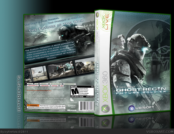
My apologies for the earlier box. This is my TOTM contribution. I only use this template when i know i can make something simple and good and put it in it. THi box is reminiscent of my Prototype and MW2 box and I actually quite like it for my first ever attempt at the ghost recon series. The lack of ESRB on the front is due to the nature of the template. Because the template is shaped the way it is, the ESRB won't fit comfortably. Also I did it for design. I compensated for the ESRB on the front with the one on the back. The Ubisoft logo, i put in the center like i did for MW2. This is a redone version of my old 360 template. Altogether, i really like it.
Many thanks to those who helped me in the forums and thanks to Squal234 & sd1833 for helping with various suggestions.
I'm a fan of the back, its a nice concept and layout. The front is a little odd - I think have the soldier taking up more space would work out for the better. My main gripe is the template - the entire side on idea doesn't flow with me.
Take any of these to consideration, and put them to use, and you can happily recieve a favourite :)
#6, Do you really think so?, i wouldn't have liked the ooriginal 360 temp with this box. I also don't like it when a character takes up a good over 50 percent of the front, unless it's absolutely necessary or just works. (e.g. GOW3 ) Here it wouldn't have worked. The background and the symbol fit together, though they take up almost as much space as the character.
Liking the back a lot. I like the front too. However, I kinda get the feeling it's a bit unbalanced. Perhaps if you added something different than the textured background. It just feels a bit crowded to me.
The adjustments made to the back add up to make a much more appealing design. The new screenborders and synopsis especially look better.
Concerning the front, I still believe the official template would be a better choice. Like I said before, it's a pretty simple image as it is, and would leave you with more space to work with. Something still could have been used to fill that space (even if it's faded now), but in the end this update is definitely an improvement.
Thanks man. Remember you helped out a lot too. Bigger? I don't know about that. I am officiallly done with this one. No more changes, otherwise i might just go crazy.
Why doesn't anyone make these things printable? What's the point in even making them if you don't intend to share them? Put a little more effort and give us what you really should be giving us. I don't mean to sound ungrateful for all your hard work, but it is entirely pointless to submit these and have us ogle them like we're at an art gallery. Unless this is copyright infringement or something, make them printable.
 Ghost Recon: Future Soldier Box Cover Comments
This is great man, nice work!
[ Reply ]
My apologies for the earlier box. This is my TOTM contribution. I only use this template when i know i can make something simple and good and put it in it. THi box is reminiscent of my Prototype and MW2 box and I actually quite like it for my first ever attempt at the ghost recon series. The lack of ESRB on the front is due to the nature of the template. Because the template is shaped the way it is, the ESRB won't fit comfortably. Also I did it for design. I compensated for the ESRB on the front with the one on the back. The Ubisoft logo, i put in the center like i did for MW2. This is a redone version of my old 360 template. Altogether, i really like it.
Many thanks to those who helped me in the forums and thanks to Squal234 & sd1833 for helping with various suggestions.
[ Reply ]
#1, Thanks Man
[ Reply ]
It looks very good! +fav.
ShatteringKatana
P.S.: Add printable!
[ Reply ]
#4, Thank you
[ Reply ]
I'm a fan of the back, its a nice concept and layout. The front is a little odd - I think have the soldier taking up more space would work out for the better. My main gripe is the template - the entire side on idea doesn't flow with me.
Take any of these to consideration, and put them to use, and you can happily recieve a favourite :)
[ Reply ]
#6, Do you really think so?, i wouldn't have liked the ooriginal 360 temp with this box. I also don't like it when a character takes up a good over 50 percent of the front, unless it's absolutely necessary or just works. (e.g. GOW3 ) Here it wouldn't have worked. The background and the symbol fit together, though they take up almost as much space as the character.
[ Reply ]
Very nice. The ubisoft on the front is a bit widen though.
[ Reply ]
Liking the back a lot. I like the front too. However, I kinda get the feeling it's a bit unbalanced. Perhaps if you added something different than the textured background. It just feels a bit crowded to me.
[ Reply ]
#8, Thanks alot.
#9, Thanks. Umm, i wasn't too sure hoow to do the top of the front especially as this is my first attempt at a GR box.
[ Reply ]
I would just like to say I freakin' love the back. The front is good, too.
[ Reply ]
For some reason this reminds me of MW2.
[ Reply ]
#11, Thanks
#12, Do you Mean my MW2 box or do you mean MW2 in general?
[ Reply ]
The adjustments made to the back add up to make a much more appealing design. The new screenborders and synopsis especially look better.
Concerning the front, I still believe the official template would be a better choice. Like I said before, it's a pretty simple image as it is, and would leave you with more space to work with. Something still could have been used to fill that space (even if it's faded now), but in the end this update is definitely an improvement.
[ Reply ]
#13, the official MW2 box.
[ Reply ]
#15, Oh I know why. It's because i used MW2 font on the back. It was kinda close to the font on the logo so i did it.
[ Reply ]
Pretty sweet dude! And I havent seen my template used in a long time haha XD
[ Reply ]
#17, Thanks, this is actually my template.
[ Reply ]
#1 Really? Huh, thought it was mine cause I made one a while back which is shockingly similar.
link
but looking I can see a few differences.
[ Reply ]
I like the changes to the back and your creative sense to the front is great. I like this alot, but I wish it was bigger though.
[ Reply ]
Thanks man. Remember you helped out a lot too. Bigger? I don't know about that. I am officiallly done with this one. No more changes, otherwise i might just go crazy.
[ Reply ]
Wow that's pretty excellent. I love the Template and Colour Scheme.
[ Reply ]
#21, Not saying to update it because it looks great XD Thanks man but you should give yourself more credit!
[ Reply ]
Its alright, but I don't think the diagonal scheme works for the back
[ Reply ]
Why doesn't anyone make these things printable? What's the point in even making them if you don't intend to share them? Put a little more effort and give us what you really should be giving us. I don't mean to sound ungrateful for all your hard work, but it is entirely pointless to submit these and have us ogle them like we're at an art gallery. Unless this is copyright infringement or something, make them printable.
[ Reply ]
Printable Added
[ Reply ]
Nice
[ Reply ]