I think this box is reallly Heavy. It's a good box. I love the effects and eveyrything, but i think that some of the stuff you have there is too much. But then again, i take a simple approach to some boxes so i guess the onlny thing thats bugging me is the style. But, however, I think the box is a little too green.
This is seriously an amazing job. The effects are jaw-dropping, as the back's layout is so official-looking. I'm not too fond of the color scheme, but it may just be because we're just too used to white-colored AC boxes. Other thing I don't like is that there's parts where the game's logo blends too much with the background.
Seriously, glad you lied about not making boxes any soon. Great job.
I think this is a really well-done box. The colour scheme is fantastic, a green/blue tone that really does suit what the game is about.
The front is well put together and extremely well detailed. Official looking and such. Back is official looking and has somewhat of a flare to it. The character array at the top is a good composition which keeps it fresh, but not too packed. You have just the right about in there.
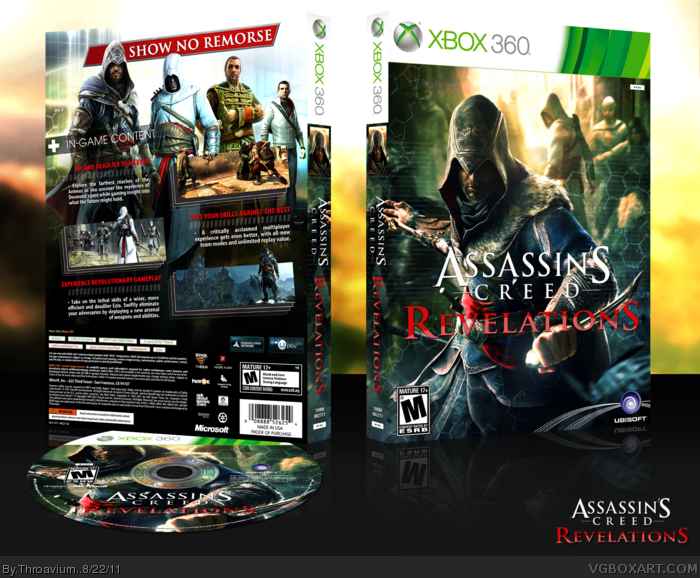
#14, I never liked doing Assassin's Creed covers in the past because of the forced color scheme. Revelations is going to use the generic blue and white color scheme, the problem with most of the artwork here is that the base color for everything is brown.
So I made the artwork much more vibrant and added some color gradients to give the cover a certain color scheme that hasn't been used before. I was working on the back when I realized that I accidentally got a greenish blue color scheme going on, so I changed the color of the front.
#15, thanks, for this, and the author fav.
#14, #16, there is a drop shadow but it's very small, I'll fix it in the printable.
Superb work. The mixture of sci-fi and historical elements on the front is smooth rather than feeling forced or unnecessary. In fact, you don't even really notice them until you're looking at it in full or printable view, in which case they blend well with the scenery.
The back is standard Throavium fare, in that it's well organized, clean/sleek, and generally stands out from the crowd. Even the edited screenshots, while a pretty basic concept, adds a lot to the overall feel and look of the back.
One of my favorite aspects is actually the color scheme. I'm so glad to see a change, as I've grown tired of the blue/red designs.
A classic hits that remind almost one week but when it's other art less then one day of course if can see it, I don't want questioning about this art actually it's really nice, My complain it's about judgement and absent some attention about other artist.
 Assassin's Creed: Revelations Box Cover Comments
Good to see you back, and my word sir you certainly have come back with a bang!
[ Reply ]
i like what you did with the screenshots, awesome.
[ Reply ]
Very good work, I like it a lot.
[ Reply ]
The AC cover I'm working on looks just like this, godammit... back to the drawing board. :/
Good work by the way.
[ Reply ]
This is amazing. It's unique but also sticks to your previous designs.
[ Reply ]
This is the coolest ac Revelations box... Where did u get the front images from I have never seen any of them?
Edited at 1 decade ago
[ Reply ]
The back, is killer. The front, is to die for!
[ Reply ]
Great to see you back, Thro. The box you have presented to us is very well made. Love the screenshots!
[ Reply ]
Too many unnecessary scanlines/hexagons, but fuck me this is fantastic.
[ Reply ]
Thanks everyone.
Edited at 1 decade ago
[ Reply ]
I think this box is reallly Heavy. It's a good box. I love the effects and eveyrything, but i think that some of the stuff you have there is too much. But then again, i take a simple approach to some boxes so i guess the onlny thing thats bugging me is the style. But, however, I think the box is a little too green.
[ Reply ]
I love it. Very different from other AC: Revelations boxes.
[ Reply ]
#11, I tried to deviate from the usual blue and white, thanks.
[ Reply ]
This is seriously an amazing job. The effects are jaw-dropping, as the back's layout is so official-looking. I'm not too fond of the color scheme, but it may just be because we're just too used to white-colored AC boxes. Other thing I don't like is that there's parts where the game's logo blends too much with the background.
Seriously, glad you lied about not making boxes any soon. Great job.
[ Reply ]
Welcome back Thro.
I think this is a really well-done box. The colour scheme is fantastic, a green/blue tone that really does suit what the game is about.
The front is well put together and extremely well detailed. Official looking and such. Back is official looking and has somewhat of a flare to it. The character array at the top is a good composition which keeps it fresh, but not too packed. You have just the right about in there.
Edited at 1 decade ago
[ Reply ]
Very well done. I would like to see a drop shadow behind the logo on the front to make it more visible though.
[ Reply ]
#14, I never liked doing Assassin's Creed covers in the past because of the forced color scheme. Revelations is going to use the generic blue and white color scheme, the problem with most of the artwork here is that the base color for everything is brown.
So I made the artwork much more vibrant and added some color gradients to give the cover a certain color scheme that hasn't been used before. I was working on the back when I realized that I accidentally got a greenish blue color scheme going on, so I changed the color of the front.
#15, thanks, for this, and the author fav.
#14, #16, there is a drop shadow but it's very small, I'll fix it in the printable.
[ Reply ]
printable please
[ Reply ]
Superb work. The mixture of sci-fi and historical elements on the front is smooth rather than feeling forced or unnecessary. In fact, you don't even really notice them until you're looking at it in full or printable view, in which case they blend well with the scenery.
The back is standard Throavium fare, in that it's well organized, clean/sleek, and generally stands out from the crowd. Even the edited screenshots, while a pretty basic concept, adds a lot to the overall feel and look of the back.
One of my favorite aspects is actually the color scheme. I'm so glad to see a change, as I've grown tired of the blue/red designs.
[ Reply ]
#18, A printable is not available at this time.
#19, thank you very much, I'll try to keep this new page filled with my best.
[ Reply ]
Wow, I missed this one! Good to see you back! This box is awesome, but slanted design on the back + 3D look a bit weird. Anyway, love this.
[ Reply ]
#21, Thanks
[ Reply ]
Might as well give up on mine at this point, superb work as always, Thro.
[ Reply ]
#23, Thanks
[ Reply ]
Edited at 1 decade ago
[ Reply ]
#25, is this some sort of 'bump' or is it that damn double post again :/
[ Reply ]
printable please!!!XD
[ Reply ]
Sorry for the quality, i did in 5 mins, credit to the original artist.
Printable :
link
[ Reply ]
Printable: link
[ Reply ]
where is your other box man?
[ Reply ]
What other box?
[ Reply ]
@Throavium oh i have a mistake! Throavium/Throavium(.)
Crysis3??
[ Reply ]
Finally, The classic hits the HOF :) Congrats!
[ Reply ]
A classic hits that remind almost one week but when it's other art less then one day of course if can see it, I don't want questioning about this art actually it's really nice, My complain it's about judgement and absent some attention about other artist.
[ Reply ]
The back is just genius on this one.
[ Reply ]