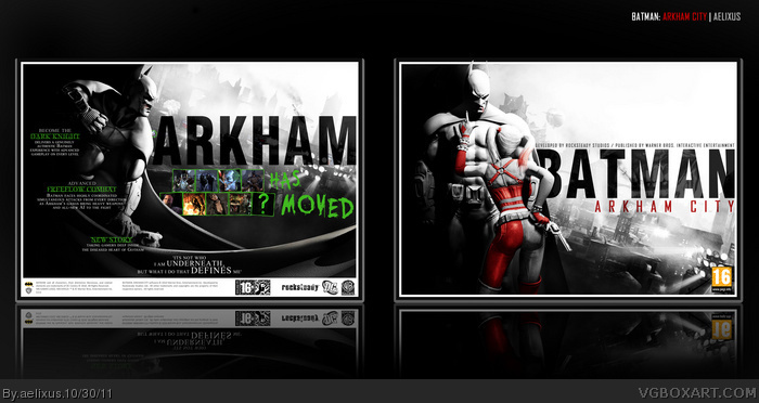
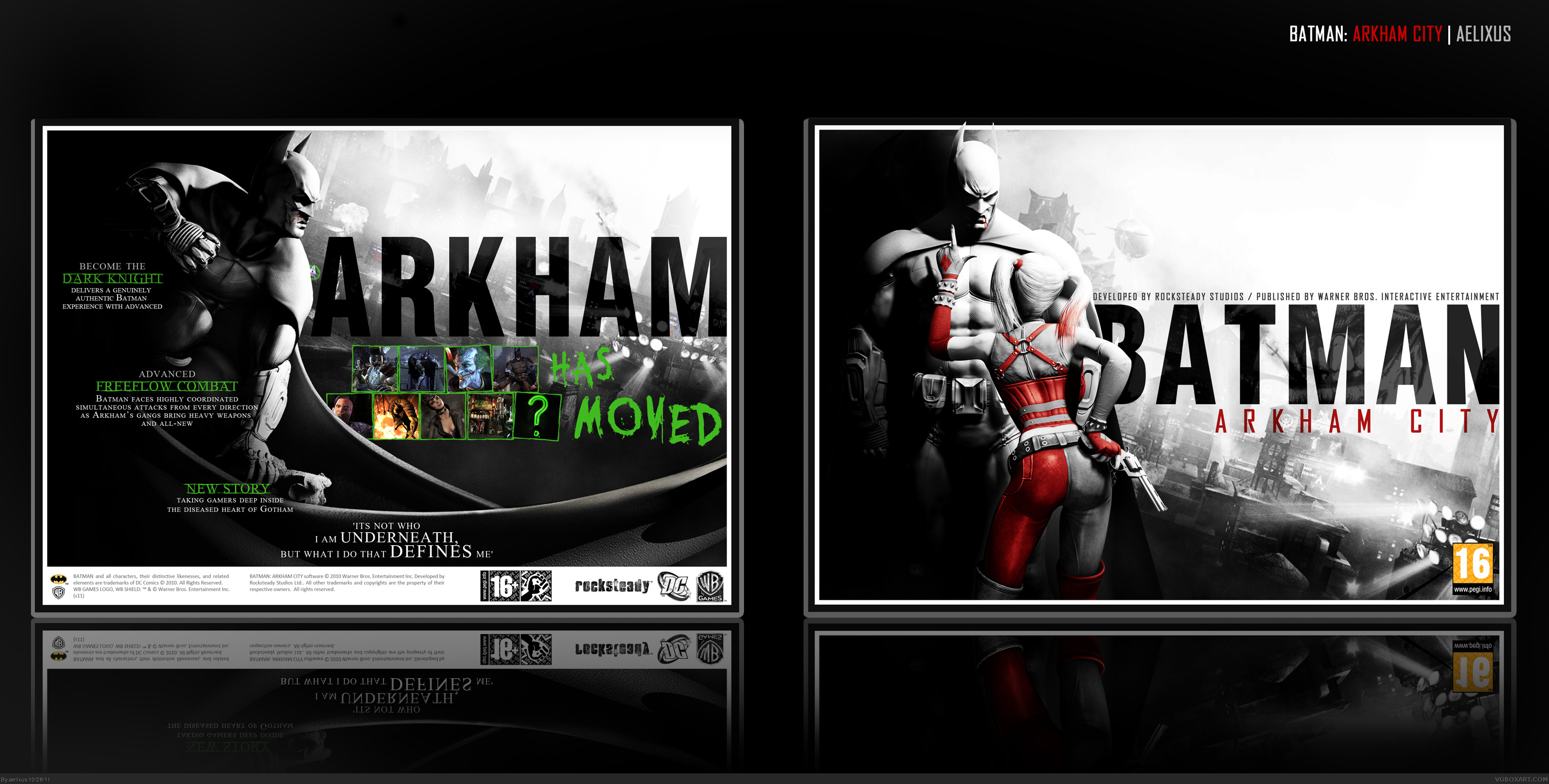
Hello there! Make box for this game is a challenge, because too much good boxes for this game were posted.
The back was inspired by cover of Gamestm Magazine: link
Enjoy!
Wow. Just wow. You managed to take the usual design of Arkham City boxes, but make it so unique and epic that it's scary. Yet another impressive work from you.
I just noticed a slight problem in the description. I get what you were trying to do, but I think you may have repeated "Advanced" and "New." But that is the only issue with the box.
I do like it. But there is something that just isn't working, and I can't put a finger on it. I think it may be the layout on the back? Green does complement red (if done correctly, but it just like isn't working here.
I would really like to see the green elements on the back be turned to red for the sake of continuity. I understand why you did it but the color monster in ma belly is poking at me when I look at it.
I like it better the way it is after seeing it. It looks suppressed in red, I don't know how else to describe it. Thanks for trying it out, now I know. :)
I never thought it would look better in red It. There is just something fundamentally off that is holding this box from being exceptional. I still like it, though.
The red text is extremely unappealing. You did right in deciding not to change it. The green feels much more natural, the red a forced attempt at consistency that the cover as a whole ultimately suffers from.
I like it a lot, my only problem with it though, is the quote from "Batman Begins." I like the idea and the originality, but the quote isn't working for me. I would have preferred a quote from either Asylum or City; "I'll never let you win Joker. Never!" or "So it's all a lie, there's nothing wrong with you." Maybe even something involving Protocol 10, or Hugo Strange. Other than that excellent work.
Kinda weird I nver faved this box :/ must be due all the comotion with black/white Batman: AC boxes? anyway, this box flows like batman gliding trough the air.......all the way from the front to the back, classic.
 Batman: Arkham City Box Cover Comments
Hello there! Make box for this game is a challenge, because too much good boxes for this game were posted.
The back was inspired by cover of Gamestm Magazine: link
Enjoy!
[ Reply ]
Wow. Just wow. You managed to take the usual design of Arkham City boxes, but make it so unique and epic that it's scary. Yet another impressive work from you.
[ Reply ]
#2, this.
[ Reply ]
#2, Thank you so much!
#3, Thanks.
[ Reply ]
This is awesome but the green on the back doesn't really complement everything else too well.
[ Reply ]
all around awesome. triple A good
[ Reply ]
I just noticed a slight problem in the description. I get what you were trying to do, but I think you may have repeated "Advanced" and "New." But that is the only issue with the box.
[ Reply ]
#5, IDK, I think green on the back can contrast with red on the front.
#6, Thanks! :D
#7, Damn, didn't notice it, thank you! Just fixed that.
[ Reply ]
#8, NOW it's perfect in every way, shape, and form. :D
[ Reply ]
#9, Thanks for the support, man! ^_^
[ Reply ]
I do like it. But there is something that just isn't working, and I can't put a finger on it. I think it may be the layout on the back? Green does complement red (if done correctly, but it just like isn't working here.
[ Reply ]
#11,I think the green looks okay with the red. Thank you. :/
#13,Thanks Sd! :D
Edited at 1 decade ago
[ Reply ]
Awesome work, Aelixus.
[ Reply ]
I would really like to see the green elements on the back be turned to red for the sake of continuity. I understand why you did it but the color monster in ma belly is poking at me when I look at it.
Love, as usual.
[ Reply ]
#14, Ok, I just changed it, but I won't update it. You can view here: link
If it looks good tell me know. :D
[ Reply ]
I like it better the way it is after seeing it. It looks suppressed in red, I don't know how else to describe it. Thanks for trying it out, now I know. :)
[ Reply ]
I never thought it would look better in red It. There is just something fundamentally off that is holding this box from being exceptional. I still like it, though.
[ Reply ]
Hehe, okay guys. Will find a way to make it better. :d
#19, Thanks, you can view the link on #15.
Edited at 1 decade ago
[ Reply ]
Very nice and different but I agree with few others...I would love to see the back text in red instead of green.
[ Reply ]
The red text is extremely unappealing. You did right in deciding not to change it. The green feels much more natural, the red a forced attempt at consistency that the cover as a whole ultimately suffers from.
Again, good work.
[ Reply ]
#20, Thanks again. :D
[ Reply ]
I like it a lot, my only problem with it though, is the quote from "Batman Begins." I like the idea and the originality, but the quote isn't working for me. I would have preferred a quote from either Asylum or City; "I'll never let you win Joker. Never!" or "So it's all a lie, there's nothing wrong with you." Maybe even something involving Protocol 10, or Hugo Strange. Other than that excellent work.
[ Reply ]
Haha, thank you! Batman Begins is my favorite movie. I love that quote a lot. I think that quote really suits with all Batman version. :D
[ Reply ]
Kinda weird I nver faved this box :/ must be due all the comotion with black/white Batman: AC boxes? anyway, this box flows like batman gliding trough the air.......all the way from the front to the back, classic.
[ Reply ]