![]() »
»
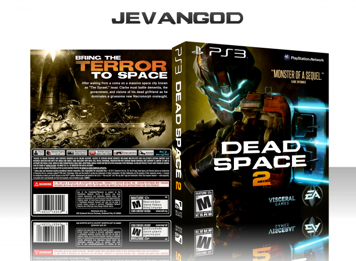
Wanted to change the color tone up a bit. I was actually going for the Walking Dead season 2 poster for the front. link
I blurred the gun on the front to make the main focus his face and I felt that it just worked so much better,
 Dead Space 2 Box Cover Comments
Comment on jevangod's Dead Space 2 Box Art / Cover.
First off, the front looks really awesome, second I thought it said "Dead Space 3" because the plasma cutter looks like a 3. It could have been reworked into a Dead Space 3 box with that concept, but a box for a real game is better.
[ Reply ]
Exactly my thoughts. Also, I reckon it would have looked nice if you made Issac on the back coloured or the beams coloured to give the back some more colour.
[ Reply ]
Same. Maybe tweak the whole design around that 3? Dead Space 3 would be different.
[ Reply ]
Your boxes always come with some sense of majesty that I can't quite comprehend. Yet, they are rather basic. I'll just call it "magic" for now.
[ Reply ]
+1
[ Reply ]
That's just amazing, man.
[ Reply ]
Wow, looks like a movie box. Really nice one!
[ Reply ]
Printable added!
[ Reply ]
I like the different approach on the color scheme.
The front is great, but the back kinda dull though :/
[ Reply ]
Nice..but it bothers me that there is no blue on the back.
[ Reply ]
Opting for a warmer color scheme instead of the usual blue was a smart move, although the single color image on the back doesn't suit the rest of the cover.
[ Reply ]
very nice
fav
[ Reply ]
Congrats
[ Reply ]
you are a god.
[ Reply ]
Congrats.
[ Reply ]
you are incredible
[ Reply ]