[ Box updated on October 24th, 2006 ] [ original ]
 Kingdom Hearts: Chain of Memories Box Cover Comments
Comment on wow's Kingdom Hearts: Chain of Memories Box Art / Cover.
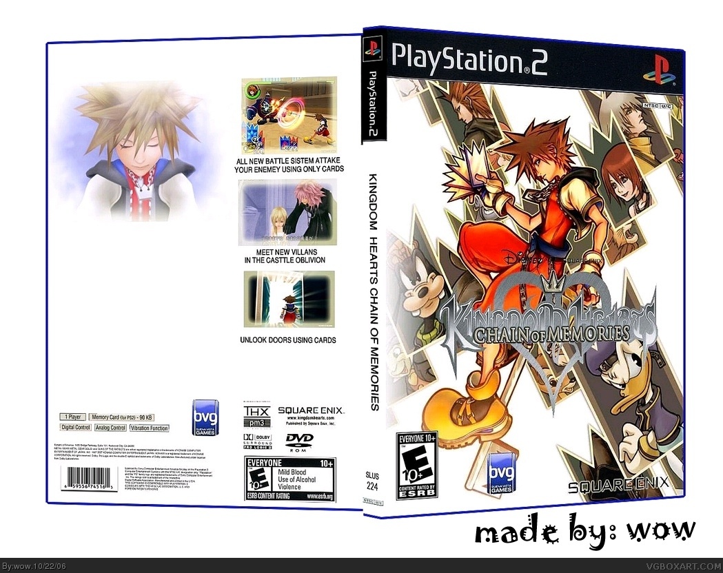
[ Box updated on October 24th, 2006 ] [ original ]
Comment on wow's Kingdom Hearts: Chain of Memories Box Art / Cover.
the reason why i didn't add a info on the box it cause all the official boxs for KH is look like that what do you think ?
[ Reply ]
who is the A$$h*** who rated this 3/5 i want to know noob why did you voted on this 3/5
[ Reply ]
i like the cover alot.
the back... eh not so much.
3.5/5
[ Reply ]
#3, all the official boxs of KH look like that , i think your score are unfair
[ Reply ]
# I aree with him , that a unfair vote .
If you see the Kingdom hearts boxarts , you will know they are all like that .
Good job wow .
4.5/5
[ Reply ]
#5, thanks dude . i updated the box with more stuff to look better
[ Reply ]
The back is too shallow and plain for a Kingdom Hearts game, this is what a Kindom Hearts' Box back actually look likes. link which is far more exciting and dignified.
I'm sure this link will help make an awesome update.
3.5/5.
[ Reply ]
#7, general i know about that site along with others what im really looking for is a image of soura face fully 3D and haven't used and big if you have that kind of image thene post the link to the site or PM the image
[ Reply ]
#8, Oppsie Daisy I did link to a good picture with my last link but some pages have a tendency to go back to their welcome screen when you link.
link
Hope you use it Wow.
[ Reply ]
#9, wow thank general thats all i need soon i will update it with the image and thanks again
[ Reply ]
i better update it fast before any one steal it
[ Reply ]
#11, also remember to select all the text on the back and go on>>>>>edit >>>>> invert so the text stands out when you edit the back, so the new background does'nt make it worse.
[ Reply ]
#12, no worry general i don't need the txt anymore i just but it up there to cover the space now its clean what do you think ?
[ Reply ]
#13, It would've been better if you edited the whole, much darker, background from that link in my previous post so it has a dark back but a much whiter front liked the KH2's box, then have the back text inverted.
[ Reply ]
#14, okay is this better ?
[ Reply ]
#15, Of course WOW the back looks a few miles better, I could nitpick on how you could make it even better if you wish; but but for now a 4/5 re-rating.
[ Reply ]
#16, its okay tell me what to do to make it better thats the coments are for right so tell me
[ Reply ]
#17 Ok if you ask put a white brush,
with a 60% opacity under the Square/Disney logo layer, any mistakes 'undo'.
You could invert the subtitle on the back from version3 and put it back, to top the cap the IMANDIX went wrong becuase a bit of the back is stretching onto the spine, you should mess with the template setting on that program.
Once done it'll be perfect.
[ Reply ]
#18, #1 wich brush thers a lot and where to find it
[ Reply ]
#19 I just meant the standard brush with a 60%
opacity which should be on a tool browser somewhere.
I'll PM back you if you need any more tips.
[ Reply ]
Moving on from our "episode", I really like this, the only potential flaws would be the template and a few very minor cut flaws. Other than that its very good, 4.5 :3
[ Reply ]
#18, okay general hers what your asked for and i didn't liked it after its smes a littile squished anyways what now do you think ?
[ Reply ]
^after truning it to 3D
[ Reply ]
Looks a lot better, great work.
[ Reply ]
ok, well each new version improves i like it alot better now. 5/5 just the top font could be better.
the reasons why i downgraded it before was that i disliked the plain white background and the fact that rikku and sora were in completely different art styles but you fixed that so yeah the only promblem now is the font for "my lost memories..." maybe a different shade of blue and a text closer to the title font style
[ Reply ]