Been a while.
(Thanks Ben for your critiques)
Oh and if you want a printable just let me know and I'll upload it.
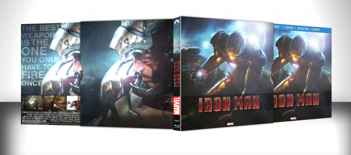
[ Box updated on December 21st, 2012 ] [ original ]
 Iron Man Box Cover Comments
Comment on Spiderpig24's Iron Man Box Art / Cover.
Nice Work Man . . .
[ Reply ]
Marvel-lous
[ Reply ]
Nice work.
[ Reply ]
Woah.
[ Reply ]
Great job, though I would recommend only keeping the Blu-ray box since having two nearly identical boxes away the appeal from both of them.
[ Reply ]
Box + the slip cover, it's all one set.
[ Reply ]
@Spiderpig24 I understand but showcasing one alone will make it stand out. For example this link looks much cleaner than the current box, in my opinion.
[ Reply ]
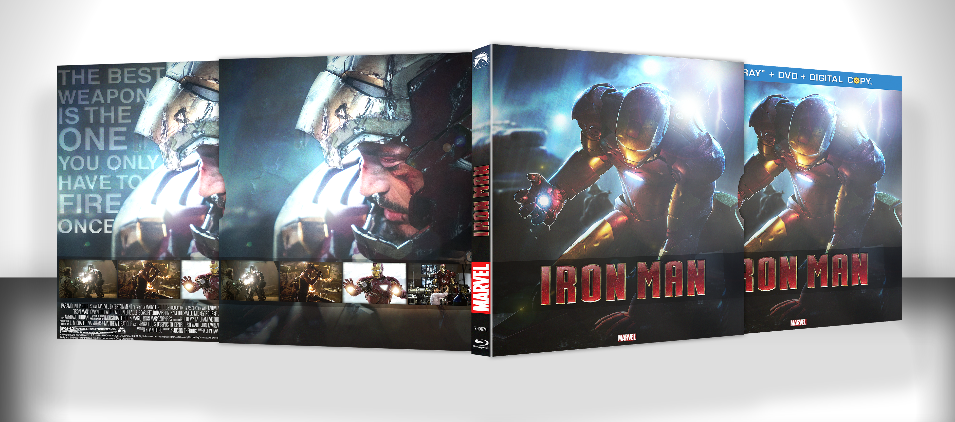
@Deathmania I disagree. As you can see the back of the actual box is different than the slipcover (And the front is as well actually), and just showing the back without the front would not have looked right. This way there is symmetry and you can see the entire case and contents of the slipcover.
[ Reply ]
Great to see a new box from you. :) I really like the lighting effects and colors.
[ Reply ]
Im liking it. Love the typography on the actual back. Slip cover looks very nice though i would have loved to see no screenshots on the actual slip cover. And not too fond of the outer glow effect on his hand, But lighting is sweet :) good job, and nice to see a cover from you!
[ Reply ]
I like the design but the screens on the slip is a big turnoff. Nice overall design though!
[ Reply ]
Thanks for the comments guys. Updated the slipcover to not have the screenshots, I do agree that it looks better without them.
[ Reply ]
Good.
[ Reply ]
Double-Post.
[ Reply ]
Wow that is purdy.
[ Reply ]
The update made it tons better.
[ Reply ]
Good work.
[ Reply ]
Personally I'm not a fan of this one like I am your other boxes. It looks clean but it doesnt feel right
[ Reply ]
Very nice Mr! Boxes should have more surface reflection to them. Still, excellent piece of machinery there :) Fav.
[ Reply ]
LIVE DAMN YOU
[ Reply ]