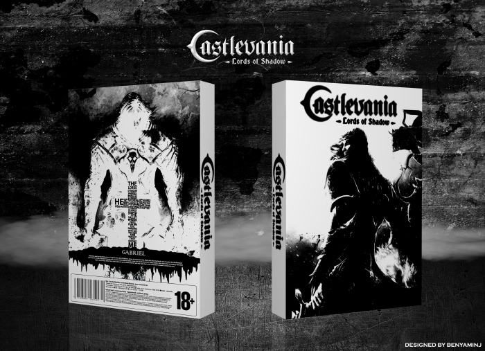
Decent idea here, but the styles are too different my liking. You have a standard front that looks a little low quality (but that may just be the preview), and you have a different design style all together with the little typography bit on the back. Perhaps sticking to one style would keep a great and even flow throughout the whole cover? top stuff, though.
 Castlevania: Lords of Shadow Box Cover Comments
Nice
[ Reply ]
Effective. I like it.
I Love T on back.
[ Reply ]
Good job, but castlevania logos on the front is not obvious, and you can more work on the spine, other than this is nice!
[ Reply ]
Decent idea here, but the styles are too different my liking. You have a standard front that looks a little low quality (but that may just be the preview), and you have a different design style all together with the little typography bit on the back. Perhaps sticking to one style would keep a great and even flow throughout the whole cover? top stuff, though.
[ Reply ]
Thanks guys
orginal logo have a shadow style...when I paint it black..around logo seems poor.
[ Reply ]
That cross looks EPIC, but both the front and the spine really lack some textured background.
[ Reply ]
Thx for tips
You're a very good person and kind
Can I ask you what country you are from ?
[ Reply ]
Thanks, I'm French.
[ Reply ]
@Oddmania Here it is necessary to have friends like you.
[ Reply ]
@Oddmania nice to meet you
[ Reply ]
its goooooooooood/very goooooooooodmeennnn/printable please
[ Reply ]
so so good !
[ Reply ]
Thx guys.
[ Reply ]
Good idea but does not work half
[ Reply ]
like Black & Wite Style . . .
[ Reply ]
thx matin
[ Reply ]
Go check , U have a private message ,:")
[ Reply ]
congrats dude!
[ Reply ]