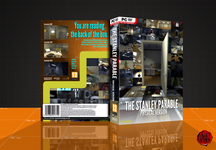
This is really well done for a Stanley Parable box. I really like the front and how you compiled all the different screenshots of the game into one cover.
That said, I'm not really sure if you even need the three main screenshots on the back. It would be better if you had that image of Stanley's back while he's at the computer, pushing buttons. The yellow line on the back would've been better if you used the same style/colour as the line in the actual game (confusing ending I believe). The blurb could be expanded and fixed (WELL instead of we'll) and I don't see much need for the 'contents', or the rating on the back as well.
Love the faded "this is the end" on the back, and the fact you chose the walls from the game. Great :)
 The Stanley Parable Box Cover Comments
Not great.
[ Reply ]
great brother ;) welcome back
[ Reply ]
Looks Good . . .
[ Reply ]
I really like what you did on the front, with the door frame, it looks pretty cool! :)
[ Reply ]
yeah. maybe...
[ Reply ]
fourth waaaaaaaaaaaaaaaaaaaaaaaaaaaaaaaaall
[ Reply ]
I like it, it matches the humour of the game. Merry Christmas.
[ Reply ]
great mix. i love it
[ Reply ]
This is really well done for a Stanley Parable box. I really like the front and how you compiled all the different screenshots of the game into one cover.
That said, I'm not really sure if you even need the three main screenshots on the back. It would be better if you had that image of Stanley's back while he's at the computer, pushing buttons. The yellow line on the back would've been better if you used the same style/colour as the line in the actual game (confusing ending I believe). The blurb could be expanded and fixed (WELL instead of we'll) and I don't see much need for the 'contents', or the rating on the back as well.
Love the faded "this is the end" on the back, and the fact you chose the walls from the game. Great :)
[ Reply ]
This is unexpected :)
[ Reply ]
Good!
[ Reply ]