![]() »
»
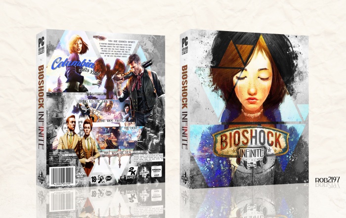
I've completed this so many times now I've lost count. One of my favourite games of all time. The ideal for this box is from Elizabeth's tear ability and although in game they are shown as gray I flipped this as it suited the cover better.
As well tearing always reminded me of a painting coming alive just as Elizabeth does at one point. This suited the sources I used and I created a secondary theme around this. I applied many different textures and effects to try and achieve that style to it.
I also decided to try out a different presentation style for this. Hope you all like it.
Credit to Deividas for inspiration on presentation and some styles I've used within this.
Original front art found here link
Thanks/ credit to Ergo for letting me use his 'Columbia calls you' render.
Comments and thoughts and always appreciated. Thank you.
 BioShock Infinite Box Cover Comments
Comment on rob2197's BioShock Infinite Box Art / Cover.
Aw man, I was gonna use those triangles on a Deus Ex box!
Anyways, this is a really great box, and making everything black and white except for whats in the triangles? Brilliant.
[ Reply ]
Dude go for it with the Deus Ex box it's all cool. And thanks man great to have your feedback.
[ Reply ]
@rob2197 Yeah the Deus Ex thing is a pretty different idea, it just happens to use da triangles. I'm quite surprised that you're able to crank out such quality boxes in shorts amount of time. I have yet so see any other artist who can do that.
[ Reply ]
@Carlj1497 Thanks a lot man.
[ Reply ]
Where did the art come from?
[ Reply ]
Added it to the description, thanks for the comment
[ Reply ]
I like.
[ Reply ]
Thank you
[ Reply ]
awesome
[ Reply ]
Thankss
[ Reply ]
This looks nice. Like how dynamic the back is. I'd credit the artist that did the art of Elizabeth on the front thought.
[ Reply ]
Thanks man, yes I've added that to the description although I would like to add it wasn't just a simple copy and paste for the art, I did put effort into changing it. Again thanks.
[ Reply ]
@rob2197 Oh, I know you edited it. I've seen the existing image before as a wallpaper elsewhere. I was just saying, because it's a fanart and not official.
[ Reply ]
Very good idea with the triangles and the colours. Only thing I dislike are the screenshots on the back. They seem unnecessary. Maybe some other artwork would have done the job (and single ones, not two-three crammed together).
[ Reply ]
Thanks a lot man, I see your point and I'll look into changing to screenshots up a bit, thanks for the comment
[ Reply ]
Very Nice Brother ;)
[ Reply ]
Thanks a lot man
[ Reply ]
Looks amazing!!
[ Reply ]
Thank you!
[ Reply ]
Congrats!
[ Reply ]
Thank you!
[ Reply ]
Congrats Rob . . .
[ Reply ]
Thanks!
[ Reply ]
Congrats Brother ;)
[ Reply ]
Thank you!
[ Reply ]
well deserved..congrats.
[ Reply ]
Thanks :)
[ Reply ]
why printable not available?
[ Reply ]
Cause I made this ages ago and haven't got the file for it anymore
[ Reply ]