Yeah easy to spot. Playing on how self aware and 4th wall breaking the F2 was. Makes loads of similar references to older titles in the game. Thanks Frank.
Looks alright, plain and simple. I don't really like the same sort of render appear twice on a box, though (I guess it's due the lack on resources?) I also think the spine could be more in tone with the rest of the box.
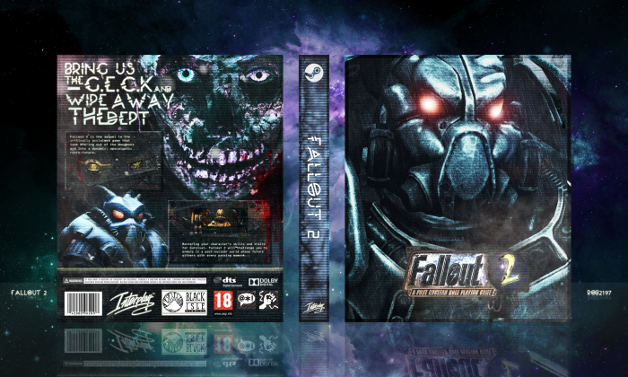
I like it. Tagline/spine font (Moon, right?) in my opinion doesn't correlate with the sorta gritty theme you got going, but everything about the rest of the cover (color palette especially) look pristine. Good job man.
 Fallout 2 Box Cover Comments
Bioshock Infinite inspired tagline?
Really cool box, my guy. ;)
[ Reply ]
Yeah easy to spot. Playing on how self aware and 4th wall breaking the F2 was. Makes loads of similar references to older titles in the game. Thanks Frank.
[ Reply ]
Tagline is weirdly arranged (to me reads Bring us the and GECK) and the body text is too small but otherwise a nice design.
[ Reply ]
i agree with sarashi about the text, but aside from that this is pretty freaking awesome. really nice job!
[ Reply ]
I like the texture you have on this, but do agree with Sarashi about the text on the back. Other than that, this is pretty solid. Good work.
[ Reply ]
Thanks everyone, I've updated the back with some of your suggestions.
[ Reply ]
Looks alright, plain and simple. I don't really like the same sort of render appear twice on a box, though (I guess it's due the lack on resources?) I also think the spine could be more in tone with the rest of the box.
[ Reply ]
AMAZING!!!
[ Reply ]
I like it. Tagline/spine font (Moon, right?) in my opinion doesn't correlate with the sorta gritty theme you got going, but everything about the rest of the cover (color palette especially) look pristine. Good job man.
[ Reply ]
Thanks man.
[ Reply ]
I like it
[ Reply ]
I like you
[ Reply ]
Fun times.
[ Reply ]