Ever since I came up with the concept for Hostile, this is how I wanted it to look. But since I wasn't any good with GIMP at the time, I could never get this design. So now, 1 year and 4 days later, I finally got it the way I always wanted it to be. :)
I'm not going to make a box for a while, so I thought I'd end with a remake of one of my favorite boxes.
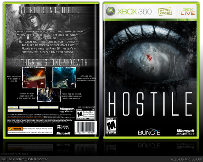
This dude on the front seems like from some other game. Rainbow Six if I am right.
Anyway, front cover looks great. I think there should be more this blue colors on the back. Cos it's too gray.
#6, haha. Thanks dude. I myself wasn't as pleased with the back as opposed to the front. But ah well. I thought of the slogan and really wanted to add it. :P
However, the back...I think if you just keep "There is no hope" and decrease the size of the font on "there is only" and increase on "Death". That'd be more impactful.
Never the less, very good box Bob (that your real name?). :)
 Hostile Box Cover Comments
Ever since I came up with the concept for Hostile, this is how I wanted it to look. But since I wasn't any good with GIMP at the time, I could never get this design. So now, 1 year and 4 days later, I finally got it the way I always wanted it to be. :)
I'm not going to make a box for a while, so I thought I'd end with a remake of one of my favorite boxes.
[ Reply ]
This dude on the front seems like from some other game. Rainbow Six if I am right.
Anyway, front cover looks great. I think there should be more this blue colors on the back. Cos it's too gray.
[ Reply ]
#2, Thanks. And ya. The guy on the front is from Rainbow Six, i thought it fit the design. :P
[ Reply ]
I love it, the style especially....fav+
Edited at 1 decade ago
[ Reply ]
Thanks Mystics. :D
[ Reply ]
hole-E-shit, the front is amazingly superfantastically awesome (times two ;)) the back is awesome to, just not as amazing as the front.
[ Reply ]
#6, haha. Thanks dude. I myself wasn't as pleased with the back as opposed to the front. But ah well. I thought of the slogan and really wanted to add it. :P
[ Reply ]
The front is perfect for this kind of box.
However, the back...I think if you just keep "There is no hope" and decrease the size of the font on "there is only" and increase on "Death". That'd be more impactful.
Never the less, very good box Bob (that your real name?). :)
[ Reply ]
#18, thanks. :)
And my real name's Michael, lol. I have no idea where i got Radioactive Bob from. o_0
[ Reply ]
The front is chilling, this box is very effectively made.
[ Reply ]
Thank you EG. :)
[ Reply ]
this is prefect, i love it ! =]
and i like the starship troopers screens on the back
they fit this game perfectly
+fav
[ Reply ]
This box is bangin' looks great!
[ Reply ]
#12, I was wondering if anyone would mention my choice of screens. :P
And thanks.
#13, Thanks, Shady. :)
[ Reply ]
Have I said how great of a box this is? I love your boxes and this one is no exception. The design is nice and crisp, clean, and original.
[ Reply ]
The front looks menacing... Just like it should look
insta 5/5
Edited at 1 decade ago
[ Reply ]
#15-16, thanks guys. :)
[ Reply ]
eerie but beautiful, great unique design, clean & official-looking.
great job.
[ Reply ]