Apollo, this is probably the best RE3 box I've ever seen, if not only because you finally found a new way to use the over used RE3 artwork, and NOT resort to using renders from a later game. Great work.
finally a unique box for the game... certain (self-appointed re-king) users should learn a lesson from this one!
however I do wonder why you were using texture on the rating, since all other logos got none (which is the way it should be).
talking about the rating: it looks like the australian one, am I right? In case I am: do australian PAL-games have the address of germany (nintendo of europe) and "assembled in germany" on it? Australia may be PAL, but that#s a bit... weird?
Oh and the back says "Wii -Logo (c) by...". But I don#t see any Wii-Logo. It should be "gamecube-logo (c) ..." since you made a cube-package. ;)
#18, I appreciate your admiration of the uniqueness ;]
As for the rating, it was bright red and way too out standing so I decided to make it blend in almost seemlessly, but didn't find it too necessary to do it with the dev logos.
As for everything else, I didn't make the template, and they're minor details that I didn't notice, nor think they need to be edited.
 Resident Evil 3 Box Cover Comments
=O
[ Reply ]
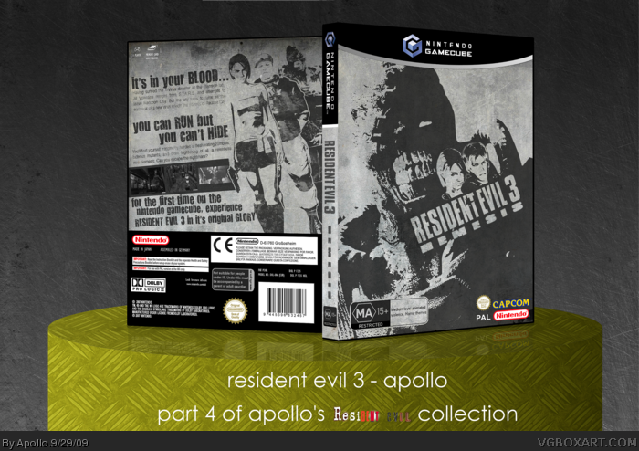
Part 4 of my Resident Evil Collection. Expect Resi 4 and 5 to come.
MY GOD THAT TOOK FOREVER TO UPLOAD
HEY BIZNITCHES I ACTUALLY GOT BACK TO IT.
After several months and attempts at making an RE3 box, I finally did it, with inspiration from Ervo's RE2 box.
link
Anywho, I'm happy with it, hopefully so are you.
And for those that missed it, check out my previous Resident Evil boxes as part of my Resident Evil Collection.
link
link
link
[ Reply ]
O.O! Absolutely beauuuuuutiful!
[ Reply ]
Awesome!
[ Reply ]
I try to make a Resi 3 one time, it's so hard to make
you pulled it of amazingly!
Edited at 1 decade ago
[ Reply ]
Great work, man :)
[ Reply ]
I'll have some of that.
The N in Nemesis is a little hard to distinguish.
[ Reply ]
FINALLY! a truly original Nemesis box! love it man!
[ Reply ]
Sweet composition and style.
P.S. You WIN
[ Reply ]
Sexy stuff ;]
[ Reply ]
Yes.
[ Reply ]
Great job, I liked the way you used the desaturation.
[ Reply ]
Thanks all. :D
[ Reply ]
Wow man. Super stylish and excellent composition. This design is slick as hell.
[ Reply ]
Apollo, this is probably the best RE3 box I've ever seen, if not only because you finally found a new way to use the over used RE3 artwork, and NOT resort to using renders from a later game. Great work.
[ Reply ]
#15, To be honest... The faces of Jill and Carlos on the front are from Umbrella Chronicles :P
[ Reply ]
#16, ... I'm gonna let that slide this time... I hate you. X<
[ Reply ]
finally a unique box for the game... certain (self-appointed re-king) users should learn a lesson from this one!
however I do wonder why you were using texture on the rating, since all other logos got none (which is the way it should be).
talking about the rating: it looks like the australian one, am I right? In case I am: do australian PAL-games have the address of germany (nintendo of europe) and "assembled in germany" on it? Australia may be PAL, but that#s a bit... weird?
Oh and the back says "Wii -Logo (c) by...". But I don#t see any Wii-Logo. It should be "gamecube-logo (c) ..." since you made a cube-package. ;)
"it's in your blood" is gettin old ;)
Edited at 1 decade ago
[ Reply ]
#18, I appreciate your admiration of the uniqueness ;]
As for the rating, it was bright red and way too out standing so I decided to make it blend in almost seemlessly, but didn't find it too necessary to do it with the dev logos.
As for everything else, I didn't make the template, and they're minor details that I didn't notice, nor think they need to be edited.
[ Reply ]
Very nice!
[ Reply ]
#19, sure... but people like to complain about such details ;)
[ Reply ]
Thank you all for your faves and comments, RE4 on the way, and I'm not holding this one off!
[ Reply ]
Awesome:) + fav
Edited at 1 decade ago
[ Reply ]
Me likes. :)
[ Reply ]
Please send me a link, I want to print it...
[ Reply ]
I'm REALLY sorry, I do not have the files anymore :(
If it makes you feel any better, it wasnt in 300dpi anyway
[ Reply ]